
GMOOC (Gamified Massive Open Courses)
Gamified Massive Open Courses. An award-winning e-learning platform built around interactive quest-based learning.
Project type
Website
Technology
HTML, CSS/SCSS, JavaScript,
PHP (CodeIgniter), Vue
Year
2019
My Role
UI Designer, Frontend Developer
Team
Small academic team
(PM, Developer)
Awards
🥇
Gold Medal — Invention, Innovation & Design
IUCEL 2018, eLCC 2019
🏆
Best eLearning Management System
IUCEL 2019
Overview
G-MOOC is an open online course platform built around gamification—turning traditional course material into interactive quests that learners progress through at their own pace, collaborating and competing along the way.
The platform had already earned recognition before I joined, including a gold medal at IUCEL 2018 and the Best eLearning Management System Award at IUCEL 2019, validating the concept it was built on.
I was brought in on a contract basis as the UI Designer and Frontend Developer to raise the visual and experiential quality of the platform to match that recognition. Working from the client’s creative direction rather than formal design specs, I translated their vision directly into code — handling the UI pattern design, UX improvements, and frontend implementation across the platform.
The work involved taking an academically proven but visually rough product and giving it an interface that felt as engaging as the gamification concept behind it: clear progress cues, intuitive quest flows, and a visual language that made the learning experience feel rewarding rather than merely functional.
Process
Step 1
Brief & orientation
Received the existing site, a verbal brief, and a colour palette from the client.
Explored the platform as a user first— understanding what the gamification concept was trying to do before deciding what needed to change visually.
Step 2
Browser-first sketching
Rather than working in Figma or on paper, I sketched directly in the browser using raw HTML and SCSS—building live explorations and bringing them to the team for feedback.
This kept the iteration loop fast and grounded in real code from day one.
Step 3
Self-directed improvement
Prioritisation was driven by my own design judgment, shaped by feedback from the development team.
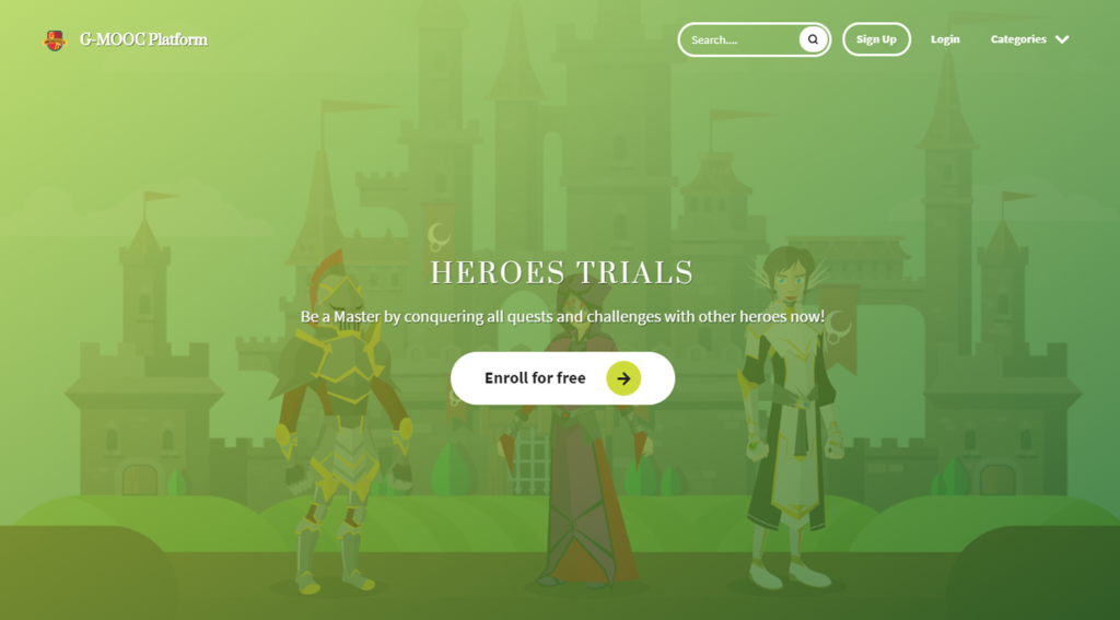
Without a PM directing every decision, I identified what would have the highest visible impact—focusing first on the Homepage, Login, and Dashboard as the core experience anchors.
Goals
G-MOOC had already proven its concept by the time I joined — the focus was on execution quality:
- To redesign and elevate the platform’s visual language so it matched the credibility of its award-winning concept.
- To improve the overall UX, making quest flows, course navigation, and progress feedback feel intuitive and rewarding.
- To implement frontend changes that brought a stronger, more cohesive UI to a product built primarily by an academic development team.
- To work efficiently from loose creative direction rather than formal specs, using initiative and design judgment to fill the gaps.
Challenges
No formal design handoff
There were no wireframes or design files to work from — just a creative direction and a running product. Every UI decision required translating an abstract vision into something concrete, demanding both design intuition and the confidence to make calls independently.
Inheriting an existing codebase
- Joining a project mid-flight meant working within a frontend structure built by others.
- Improvements had to be made without breaking what already worked, requiring careful judgment about what to refactor versus what to leave alone.
Short timeline
The contract ran for six months. Within that window, the UI, UX, and frontend all needed meaningful improvement — which meant ruthless prioritisation of the changes that would have the highest visible impact.
UI redesigned and implemented during a 6-month contract in 2019. The platform has since been discontinued—these screenshots represent the state of the product at the end of the engagement.
Retrospective
If I did this again
- Push for a lightweight component inventory at the start — even a rough Notion table of existing UI patterns would have saved time spent rediscovering what already existed in the codebase.
- Define a clearer scope contract upfront. The open-ended brief was creatively freeing but made it harder to communicate what was in and out of scope as the engagement progressed.
- Document design decisions as they happened. A lightweight decision log would have made onboarding future developers faster and produced a stronger handoff artifact.
FUKUO (Tumblr Theme Development & Web Design)
FUKUO started in 2012 as a personal project;
a Tumblr blog where a self-taught developer shared free themes with anyone who wanted them.
AgentPoint+ (Reapit)
A widely used WordPress real estate plugin and themes, focusing on the WordPress Gutenberg development project.